approach & solution
Creating a website for a startup is extremely demanding task. A startup needs to shine in the crowded market, especially if its primary target client are large institutions.
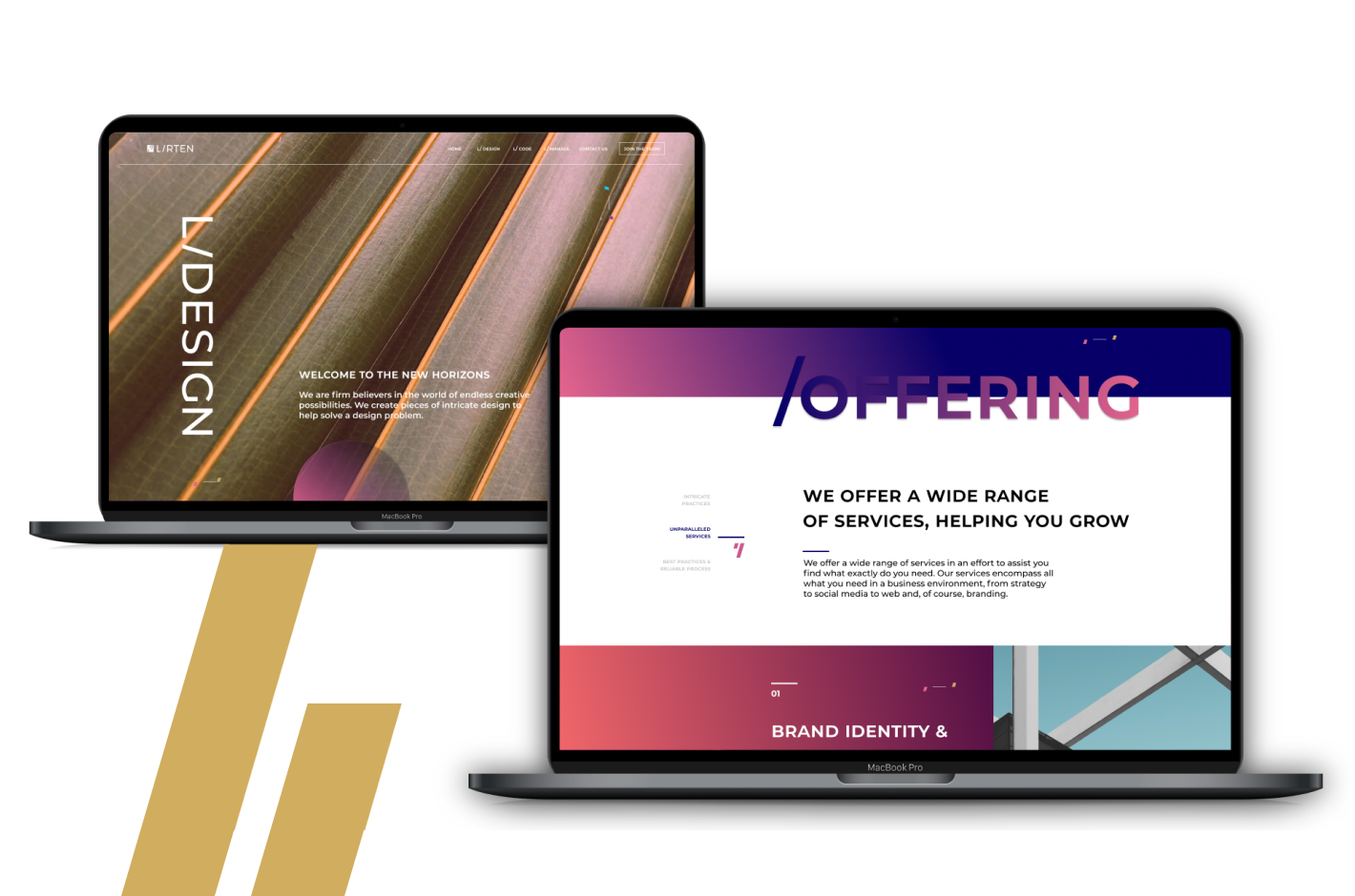
The website had to give the feeling that it is of an established company, one with history and experience in the field, yet keeping everything looking fresh and interesting.
Going forward with the website, it was apparent that we needed to create something that gives a fresh sense (and acts as if it was a brand that has been in the space long enough).
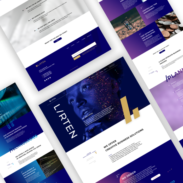
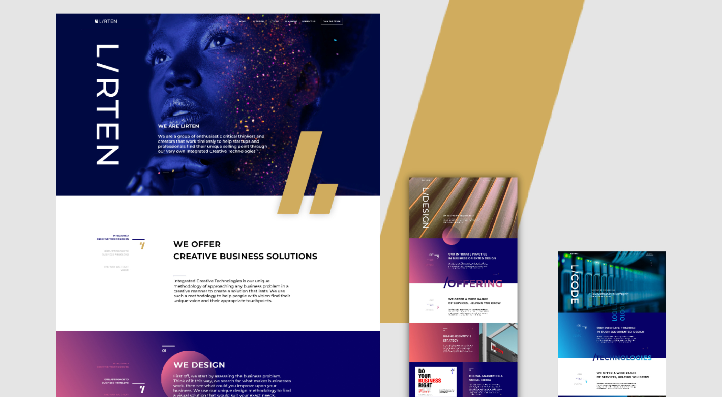
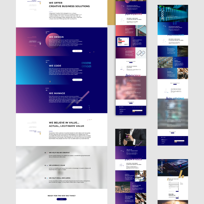
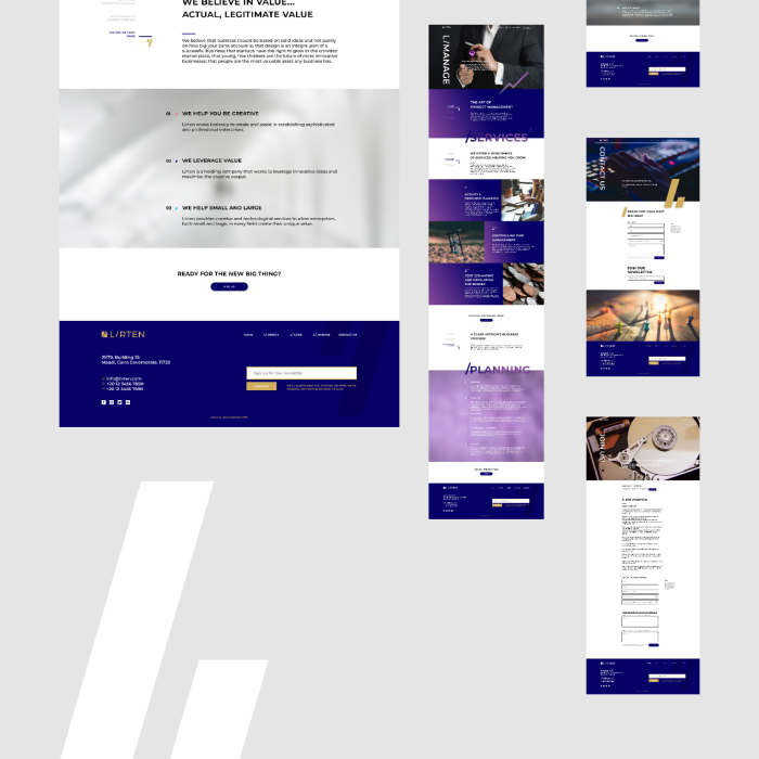
We also worked on showing the different aspects of the Lirten's business focus. Showing how it is more of a one-stop-shop to an institution's digitalization journey.
The website followed various phases. We started off by thinking what we need to tell our customers, do we need to tell them head-on, or do we need to show the different parts using visuals?
The second phase was building the messaging: what do we need to say and how, the method of writing and personality to show in the content.
Third,we started tackling the content writing, how does the content fill out in the pages? How shall we write according to the content strategy and messaging? What flow of content do we need to follow?
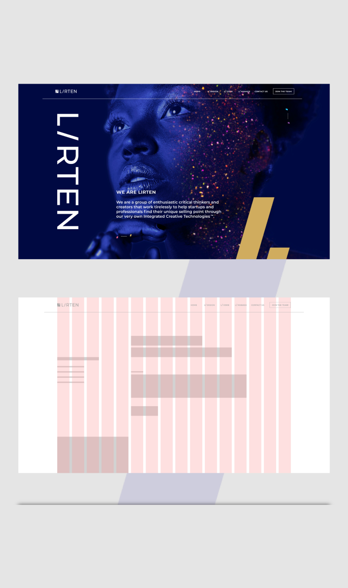
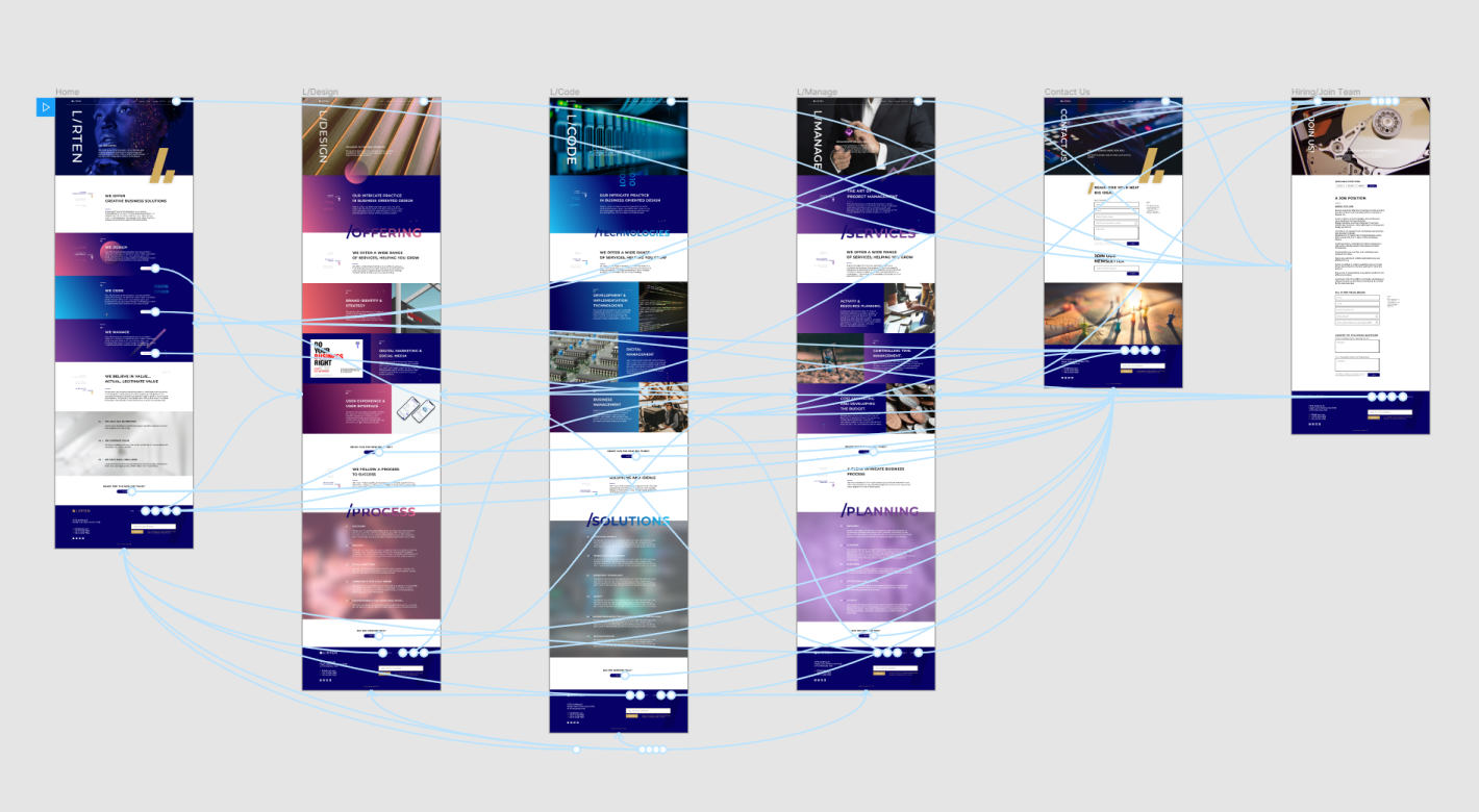
While doing this, we started going over the UX of the website, how will the user navigate? Are visual cues more important to some parts more than others? How will the user navigate? What are the parts that are important to show, what other interactions could be implied?
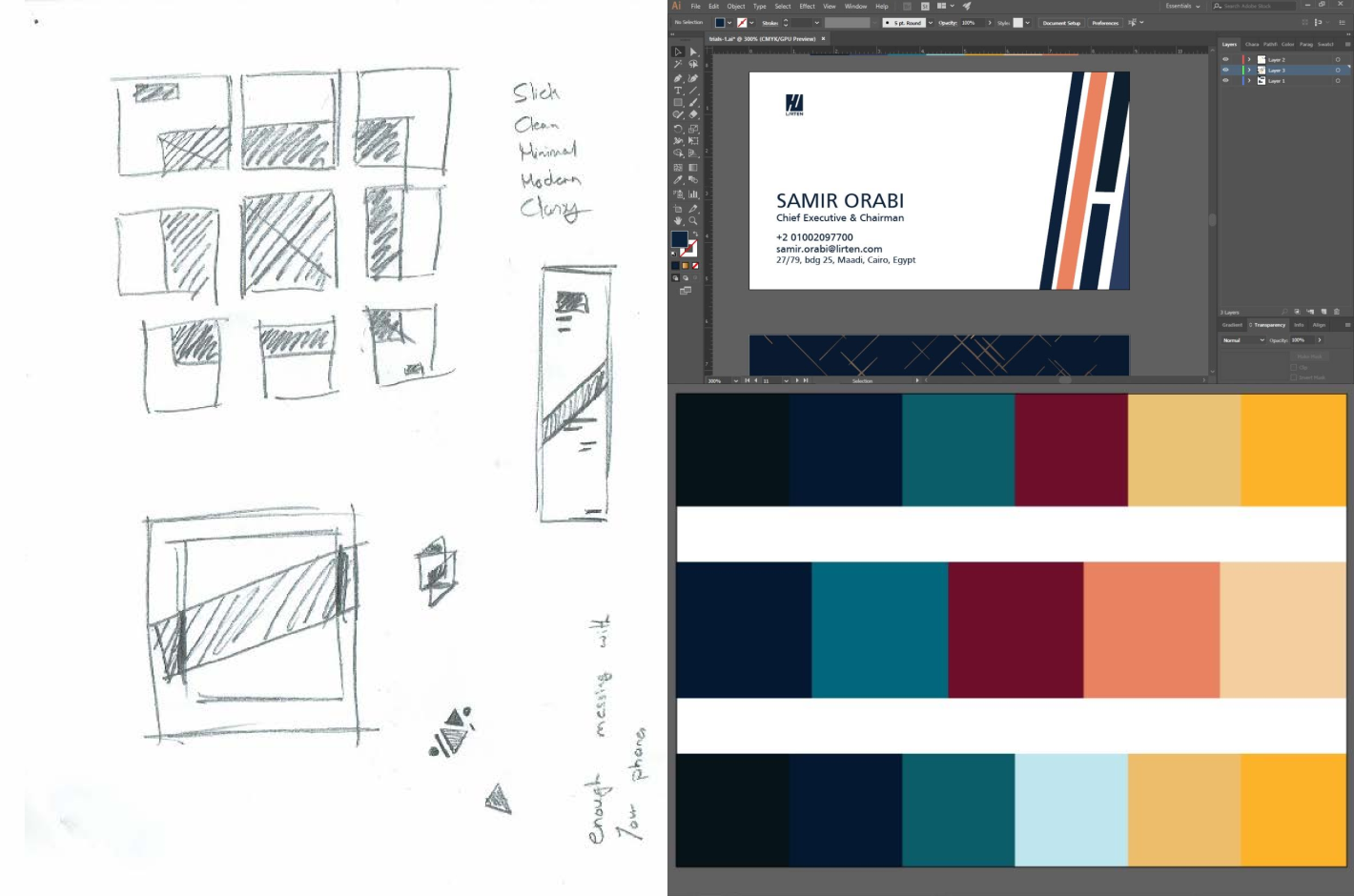
Then we moved into UI, adding the visuals, interactions, animations, etc. using the brand colors that was just developed was vital to make this work.


